
First, find a suitable image.
You need a patterned image that will not be too completely solid. Repeating patterns work best. Here are a few examples that provide some interesting animations (including the one we've used for this tutorial's headline), but almost anything can work.
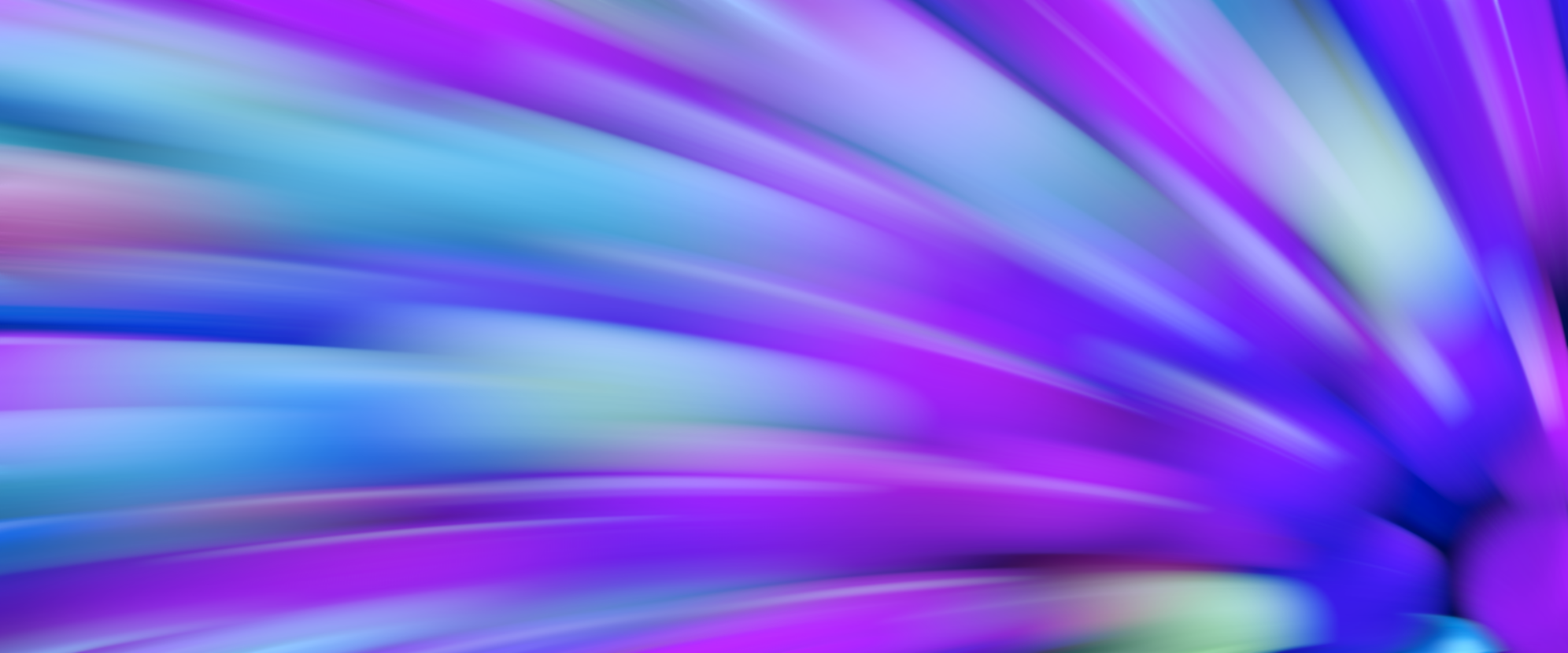

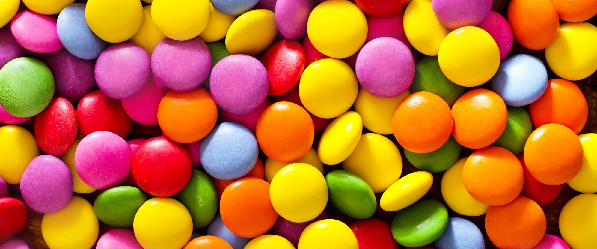

One thing to keep in mind is that the more completly your pattern fits the image, the smoother the animation will be. You can use any web-safe images (jpeg, png, webp, gif, etc.).
Prep the CSS
Choose your font
A thick font is obviously best. Thin fonts don't provide enough room for the imahe to show through. Go to fonts.google.com to browse through the hundreds of free font options there. Our example above uses Cinzel, a bold serif font.
Style the font
font-size: 4.5vw;
Adjust the font-size for your page, but make sure it is big enough... and responsive!
Set the image
Point to the image file.
background-size: contain;
Using the "contain" keyword will ensure that the whole image fits inside the text and repeats as necessary. If you use "cover" you will only get a portion of the image, and no repeat.
Make the text color transparent
So the background image shows through.
Set the text background color
For users with browsers that do not support the background-clip property.
Make the Magic Happen!
Cut the image
Show only the parts of the image that fit within the text.
Add some shadowing so the text stands out.
Animate the background!
Write the animation
The part that supplies the movement
0% {
background-position: 50px -200px;
}
100% {
background-position: 200px 50px;
}
}
Now put the whole thing together
	.animated-text {
		font-family: [Your Chosen Font];
		font-size: 4.5vw;
		background-image: url("[Path to your image]");
		background-size: contain;
		color: transparent;
		background-color: #fff;
		background-clip:text;
		filter: drop-shadow(4px 4px 6px #000);
		animation: moveBackground 5s ease-in-out infinite alternate;
	}
	@keyframes moveBackground {
		0% {
			background-position: 50px -200px;
		}
		100% {
			background-position: 200px 50px;
		}
	}
}
That's it!
The rest is up to you
Now that you have the basic principles, see what else you can do to trick it out. Add more animations to fadeit in, make it twirl, or have it grow from a pinpoint into your full-sized headline. add filters to enhance the shadows, change the colors, or fade to black. The possibilities are endless!